APP DESIGN
BMO Tutorial
A comprehensive guidance App designed to empower newcomers and provide a seamless financial journey.
Collaborated with BMO Digital Bank

My role:
UX Designer &
Researcher
My Responsibilities
- Discovery
- Design research
- User journey refinement
- User interface design
- Wireframing, prototyping
-Conducting usability studies
Team
UX Consultants (Andrew)
Industrial Consults from BMO Bank: Mariam
My teammate
Duration
Jan - Apr 2023

OBJECTIVE
Enhancing Banking for Newcomers: Creating a Digital Experience to Maximize Member Engagement
The Bank of Montreal is always looking to improve the banking experience of its client base, and to keep up with the application of new technologies into the banking industry.
The Canadian government has set a goal of receiving 500,000 people each year by 2025. New statistics show that on 2022 it reached a record of one million new residents.
That’s the reason BMO is looking for ways to cater to that specific segment, and improve their experience as newcomers.
THE DESIGN CHALLENEG
How do we effectively attract Newcomers to onboard with BMO, and prefer it over other banks?
Did you encounter challenges, navigating the Canadian banking system as a newcomer?
Newcomers most commonly experience feeling worried, overwhelmed, and confused by their finances and navigating through the Canadian banking system. High rental costs, getting the right documentation and identification, signing up for a mobile phone and credit card, and finding employment were identified as the common challenges shortly after arriving in Canada. The research also revealed that newcomers take a long-term view when it comes to achieving financial success in Canada.

THE SOLUTION
The BMO tutorial App that Empowering Newcomers with Comprehensive Tutorials' videos and Multilingual Guidance
A comprehensive guidance App designed to empower newcomers and provide a seamless financial journey. This app is tailored to each user's preferred language, offering tutorial videos that guide them step-by-step towards their financial goals. With features such as online account opening, rewarding user engagement, and exclusive discounts and cashbacks, BMO Tutorial ensures a user-friendly and rewarding experience for new newcomers.
The BMO Tutorial app revolutionizes the newcomer experience by offering personalized financial guidance and a user-friendly platform.

Our Process for the Project
Goal Definition
Research plan
Recruitment
Interview process
coding
Analysis & insights
Ideation
Information architecture
Sketching
Lo-fi Prototype
Test plan
Results
Feedback Analysis
Aesthetics Concerns
Full design
From the beginning we planned to use a typical UX workflow, towards improving the process. The initial part is key;
Understanding the existing user journey, empathizing with the user and developing insights, through the use of interviews.
After the pain points and opportunities have been identified, we planned on devising ideas and materializing them into a working prototype, that will improve through team iterations, as well as user testing.
First, we structured the Research Plan.


RESEARCH
Understanding the Needs of Newcomers
Method:
We first did preliminary research on:
-
Current situation of the financial services for newcomers
-
Other bank services for newcomers
The preliminary research aimed to understand the challenge at hand and guide the focus for the upcoming interviews. After that, we conducted semi-structured interviews .
Purpose of the research:
-
Investigating the challenges and barriers that newcomers face when onboarding to the Canadian banking system.
-
Identifying the key motivators between bank selection among newcomers to differentiate BMO from the competition.
-
Understanding the aspects that can drive newcomers to select BMO over other banks.
CONDUCTING INTERVIEWS
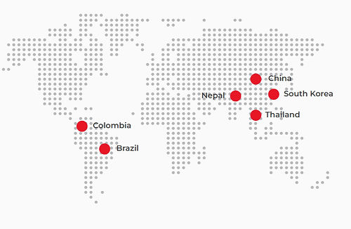
7 Interviews
Age of sample group
Interviewees are newcomers between 20 to 38 years old.
Diversity of ethnicities
Interviewees come from diverse backgrounds and cultures of the world
Banking usage
All interviewees have lived in Canada for less than 2 years, and they recently opened their bank accounts.
Diverse occupations
4 of them are studying, while the remaining 3 work.
.jpg)
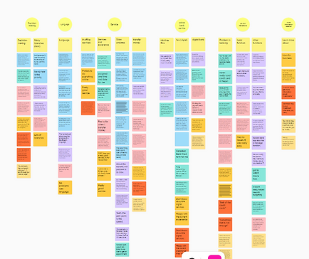
Coding
Then we started to analize each interview's transcript. We defined categories, and coded each part of each interview in order to get insights on the different topics that we were interested in exploring.
.png)
Synthesizing
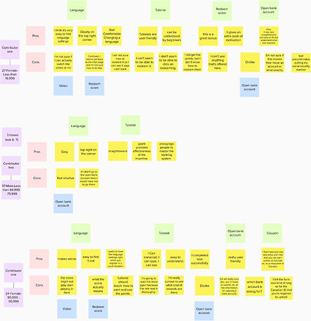
After the initial coding we decided to take the findings and information and standardize it in a more organized format. We then set up an excel file with common themes throughout the interview process, which helped us organize further the content from the coding.
All of the information from the interviews was coded and organized in a readable format, that allowed us to have a global view of pain points and goals for all newcomers.
Red = Pain Blue = Expectation

Things We Uncovered
INSIGHTS
Familiarity
A big distinction between the interviewees is how comfortable are they with the Canadian banking system.
Purpose
The largest gap between interviewees comes from their current occupation, which leads to a difference in bank services they are interested in.
Understanding
An issue that happened throughout the interviews was getting knowledge about specific products or services.


Summary
Findings led us to define 2 user personas, that would be important during the entire process, to maintain our empathy towards our potential users. Additionally we understood several elements that affect all newcomers, like the language barriers, the adaptation to a new banking system, the misunderstanding of how some products work and the basic struggles of adapting to a new environment. The user personas we devised are Amir and Sophia.
PERSONA
Understanding Who Our Users Are


Ideation For Solving the Problem
After conducting thorough research and identifying pain points, we began generating new ideas. One crucial finding was that BMO bank already offers many of the services newcomers require. However, we discovered that the real challenge lies in making these services user-friendly, transparent, and easy to understand. This is particularly important as newcomers often come from different countries with varying language and banking backgrounds

High-level idea 1
STARTING THE ACCOUNT OPENING PROCESS THROUGH THE APP
-
Download the app
-
Find a tutorial on opening the account (in your native language)
-
Fill out initial information
-
Get an appointment
-
Finish the process in the office
High-level idea 2 INCENTIVIZED TUTORIALS
-
(Already has an account)
-
Find promos on the app
-
Unlock them by finishing quick tutorials
-
(in your native language, catered to the profile)
Refined Idea
In this scenario the user would download an app that allows them to score points, to get rewards connected to doing different tutorials.
The goals of the app are:
-
Fidelization of existing immigrant customers.
-
Becoming the most recognized brand in the newcomer segment.
-
Explaining the different products BMO offers, while detailing the competitive advantages over the competitors.
-
Onboarding new clients.
User Flow
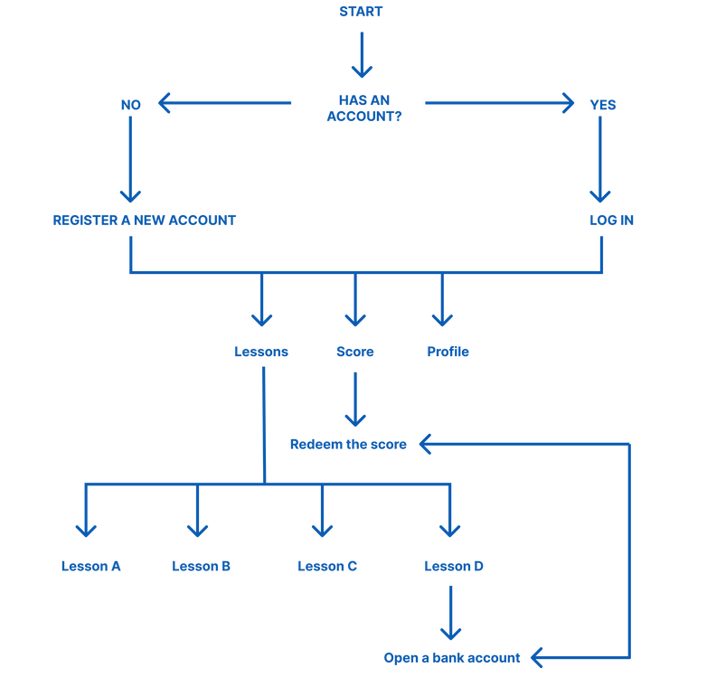
Sketch and Low-fi Prototype
We then sketched out the flow before building it out in Figma. We went through multiple iterations to solidify the flows.
.png)

Mid-fi prototype


The user would get a small introduction of potential benefits of using the app. Then they’d be prompted to select a language.


The main screens of the experience are the tutorials and the rewards states.


The user would then log in or create
an account . The first time the user will see an introductory screen that would entice them with possible rewards.

.jpg)
Each video will feature a transcript in the selected language.
The user can add it’s own notes that they’d be able to review on their profile, or by revisiting the tutorial.
User- Testing
We selected testers based on the following criteria:
● Recruit diverse participants (3 people) who meet the target audience criteria.
● A mix of ages (18 - 54 years old)
● Gender: different gender
● Position: Student or employee
● Country: Lives in Canada (less than two years)
● Device Type: Mobile (allow us to check our prototype's screen and font size)
● Operating System: Android or iOS

Goals of user testing are:
-
Does the app provide quality interactive components?
-
Do the tutorials in the app help users know better about the Canadian bank system?
-
Is the score system incentive mechanism attractive to newcomers?
-
Is it easy to open a bank account online or make an in-office appointment on this app?
-
It is helpful for the users' language barrier?
-
Are users able to understand the main intended flow of app?
The tasks to complete are:
-
Navigate to the tutorials section.
-
Navigate to the opening online account section.
-
Complete a tutorial to earn points and redeem a reward.
-
Change the language.
Testing Results
We used the “Importance / Difficulty Matrix” and the “Feedback Grid” to help us collect and analyze the information.
The top advantages of the app are its support for multiple languages and user-friendly navigation functions. Our tutorials cover the most common use cases for banking apps, making it easy to get started.
Testers have raised concerns about the videos we provide in the app. Specifically, they are unsure whether users will be able to skip the videos, and whether the videos will function properly.
MOSCOW METHODE
Prioritizing For our Next Iteration
We used the MoSCoW method to help prioritize which feedback we are able to implement for the next round of iterations.

DESIGN TOOLKIT
Establishing the Brand Tone
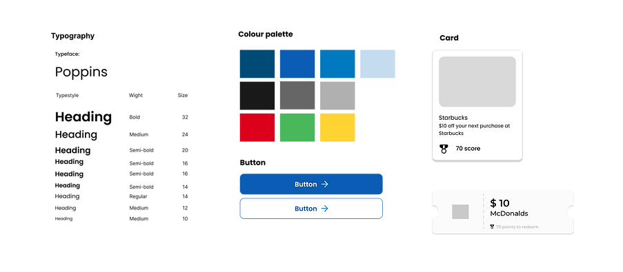
our team compiled a moodboard to establish the visual direction before embarking on the creation of the style kit. We made a deliberate selection of various shades of blue inspired by the BMO bank Brand Colour, while opting for the Poppins typeface for its readability.
Hi-Fi Prototype


We updated the main introduction for the app, allowing the user to select their language from the beginning.

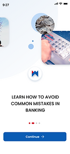

After language selection the user will see a series of screens that show them how the app can be beneficial to them.
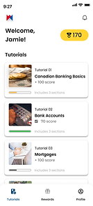


The tutorials screen is where the user would land, and one of the most important sections.
Each tutorial consists of several full screen videos, that feature a transcript (in the user’s selected language) and the ability to take notes. The user can scroll back, but they can’t move forward (using the bar at the bottom).
.png)
.png)
As the presenter speaks in the video, the transcript gets updated The proposed format mimics the format of Instagram reels or TikTok videos, appealing to an established visual standard.
As an interesting option, the videos can be created using AI, and the presenter would actually be able to speak in the user’s language.


The rewards section displays all available rewards, with a featured rewards section on top, for specific bank alliances or to showcase the most trendy ones.


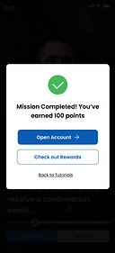
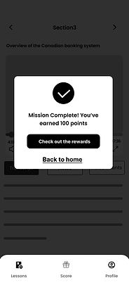
We propose a special tutorial, connected to opening a bank account. The rationale behind it, is that this is one of the first steps that a newcomer takes when arriving to Canada.
The main CTA after finishing the tutorial is to open an account.
This concept can be applied to other tutorials outside of the scope of this project (mortgages, loans, etc.).
.png)

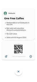
When the user redeems a reward, they will be taken to a “My rewards” section, where they can tap on each of their redeemed rewards to get a full list of terms and conditions, and a QR code to make the reward effective.


When applying to open an account the user will have the option to open it online or in office.
Introducing BMO Tutorial
Dashboards
Watching Tutorials
Earning Points
Redeem
Learnings
Overall, reflecting on this process really helped me extract key points, learnings, as well as blockers that I could eliminate to improve the process next time. Here are some of the lessons learned:
-
Align App goals with marketing goals.
-
Create user personas. By creating the ideal Coursera customers through personas, you'll be able to design the right solutions.
-
Testing gives you a valuable collection of user feedback that you can use to improve your site and to understand what's working
